Ai tool page redesign
Following the successful launch of the first Beta version of Spring in 2023, the flow and brand needed updating for an improved, more refined experience.
Context and challenge
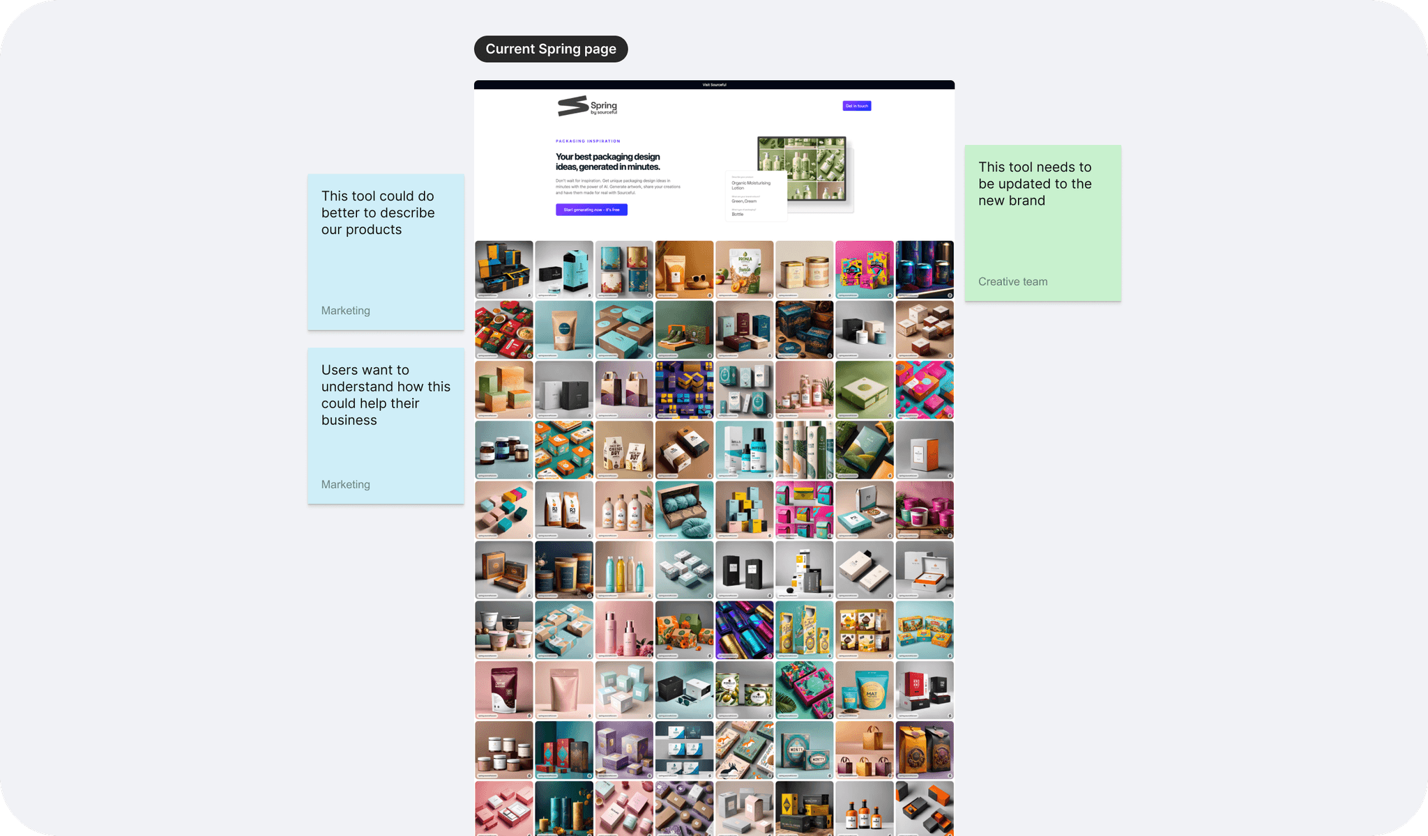
Spring is an Ai powered tool that generates packaging images. The initial version generated 200,000 images and produced $8K in marketing revenue without any spend, attracting notable clients like Unilever — all achieved within 4 weeks from prototype.
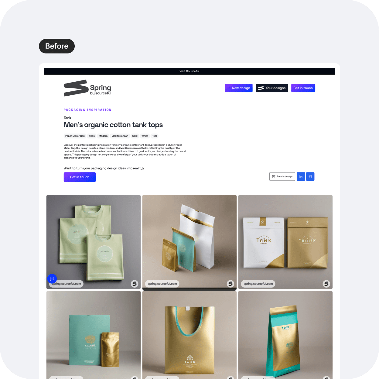
However the current Spring tool fails to align with the new brand identity and the latest Design system. It lacks consideration for the ideal users' needs and does not effectively connect the displayed images to the product offerings.
The team and my role
The cross-collaborative agile team includes 1 UX designer, 1 UX/UI designer (myself), 1 Marketing product manager, and 2 developers. Here is a list of my tasks:
Refine the UX visuals for the entire user flow: from the landing page to the results page.
Design a UI for each page of the flow, aligned with the new branding and the live new website.
Present the final designs to the stakeholders and the engineering team.
The design process
I first took a step back, and placed myself as the user. How would I love to feel if I landed on a page that presented me with a tool like this? "Play. Immersion. Inspiration. Wowing effect." That's what came to mind and I designed with the latest branding in mind.
In this project, let's focus particularly on the updated UI with the header, the gallery, and the results page.
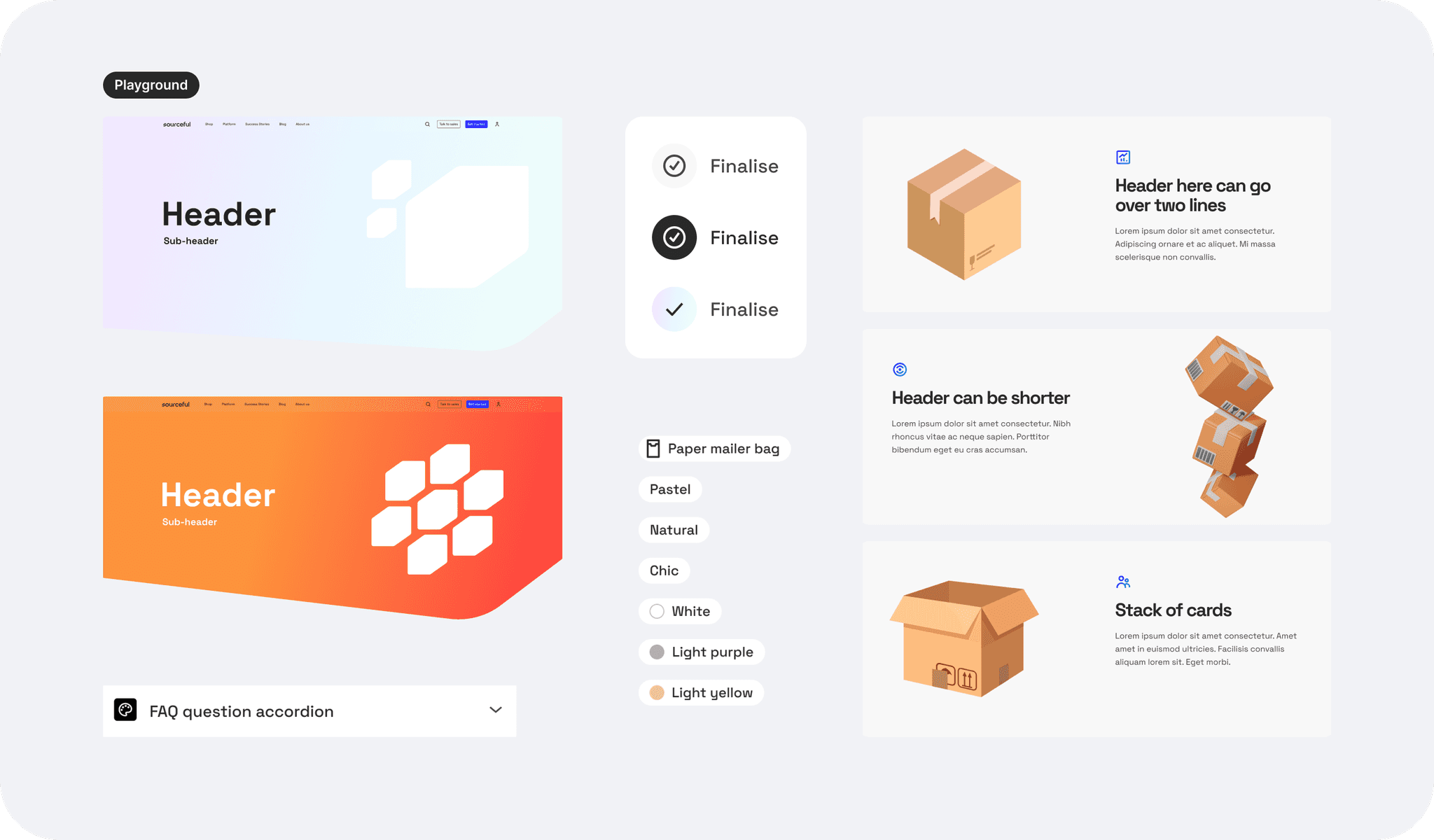
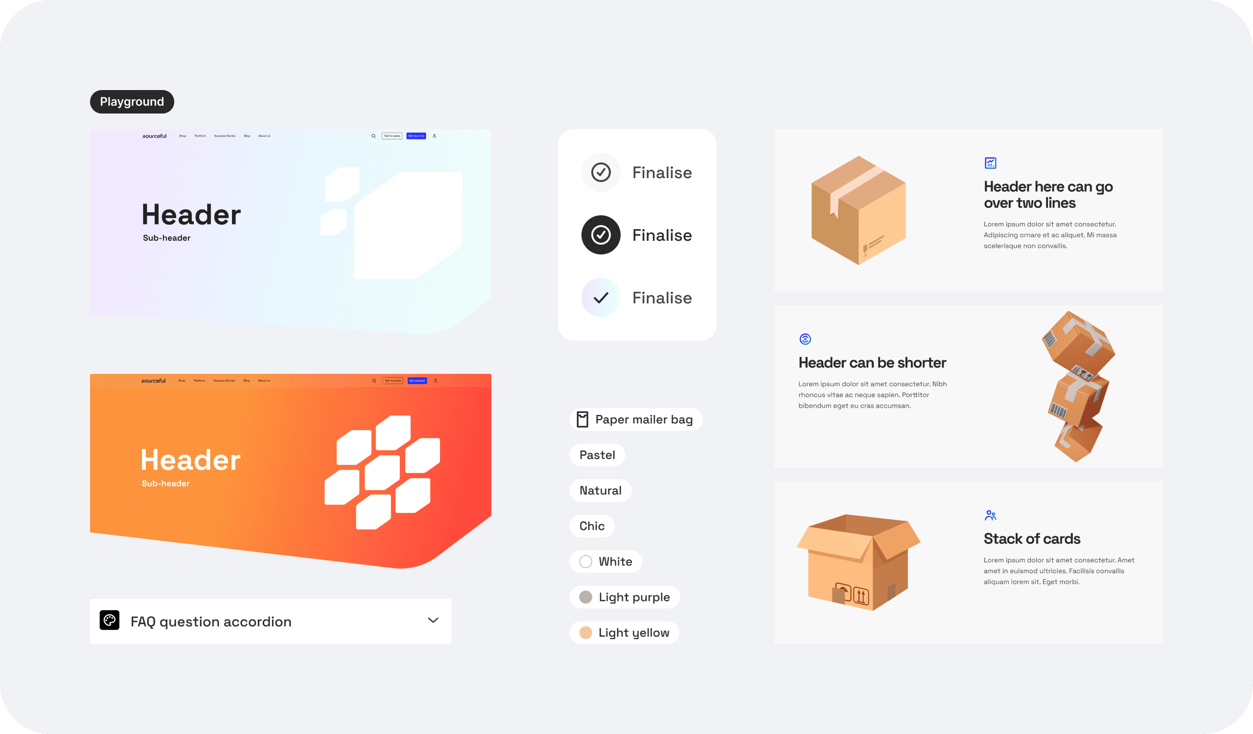
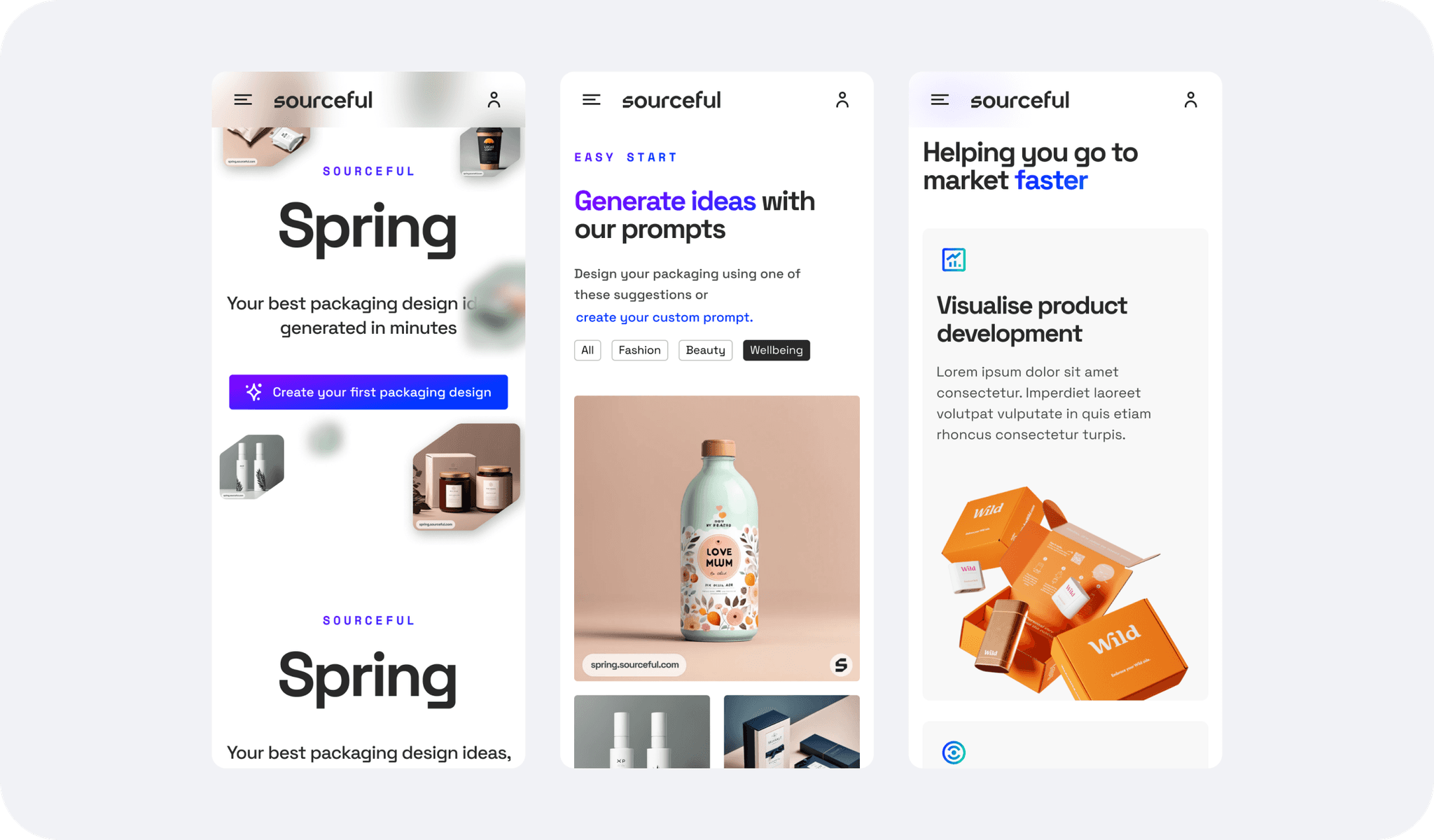
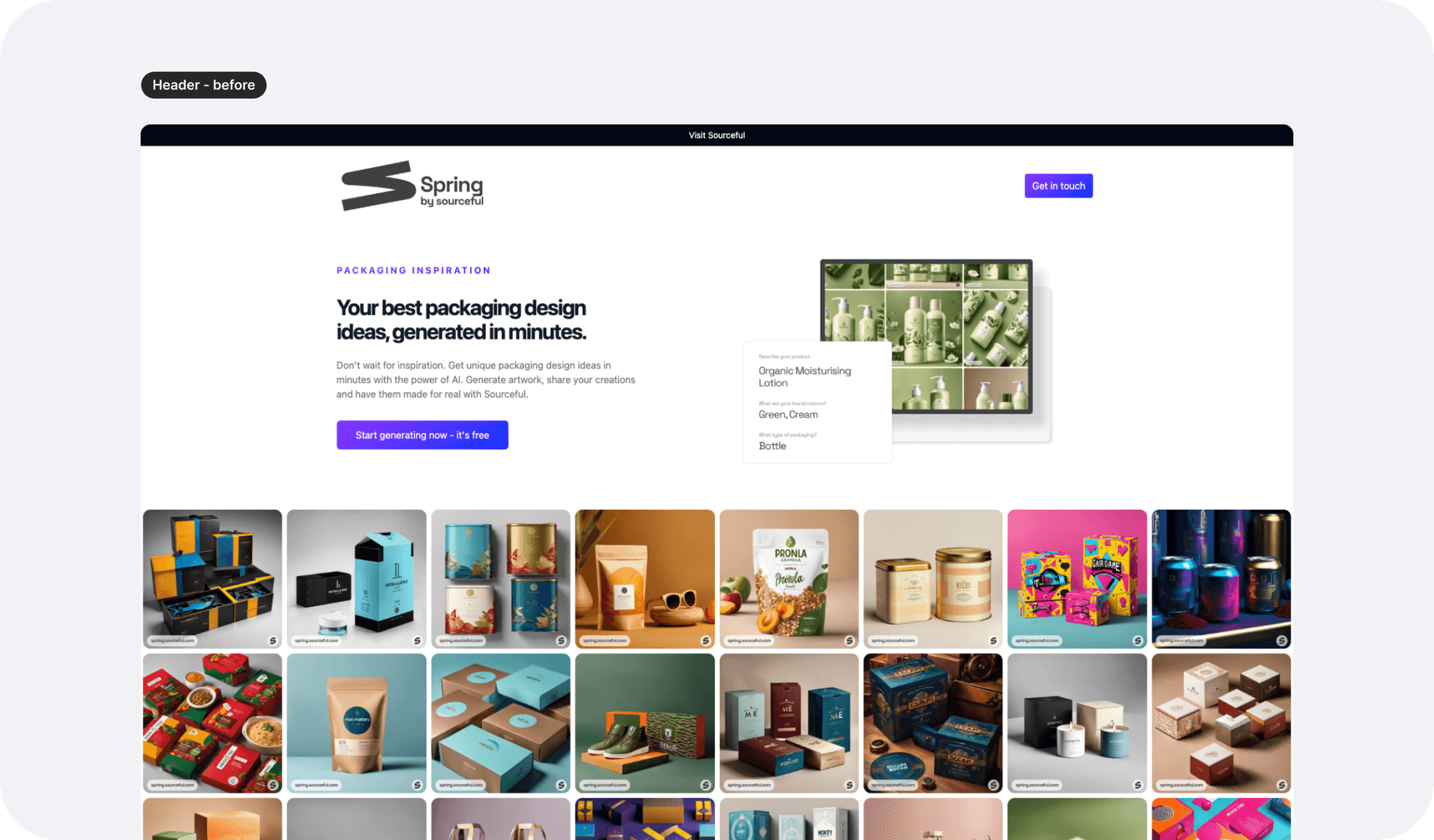
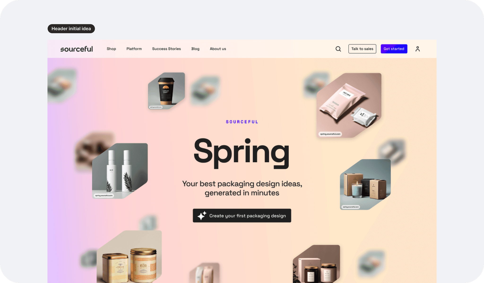
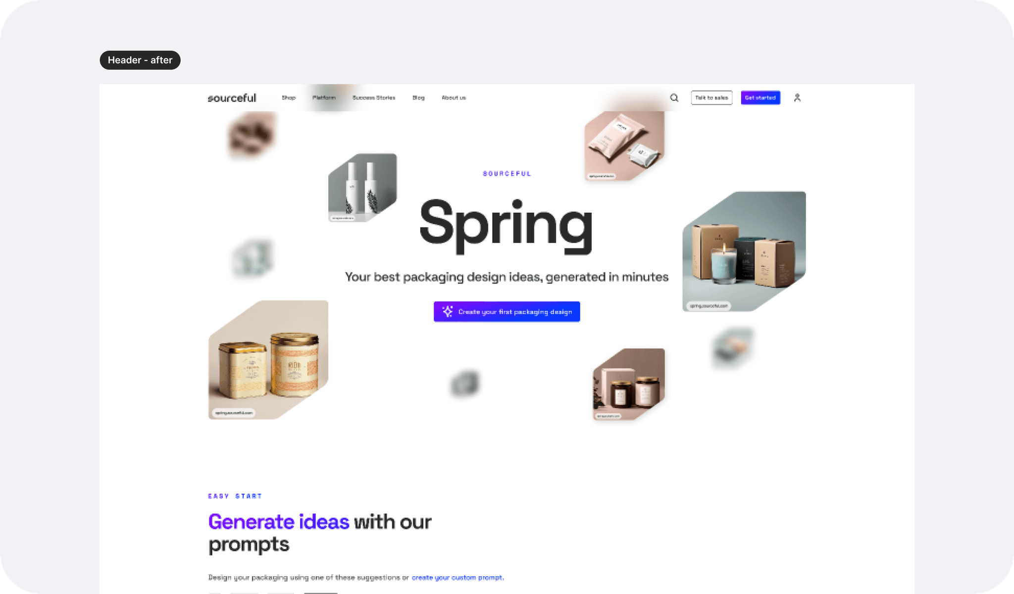
UI: the header
As shown below, the wireframe header put the emphases on the CTA, in a similar way the first version header did. Keeping that in mind, I decided to suggest some options for something that would feel immersive yet airy so that the user would:
Understand what this is about before clicking the CTA
Be able to click straight on the CTA if that is not their first visit.
I also played a lot with different header styles to showcase the brand, including a gradient background, although since the display will show different and random images, I wanted to avoid a colour clash and a potentially aggressive first view, so I opted back for a white sleek background. You can see drafts as well as the final version below.
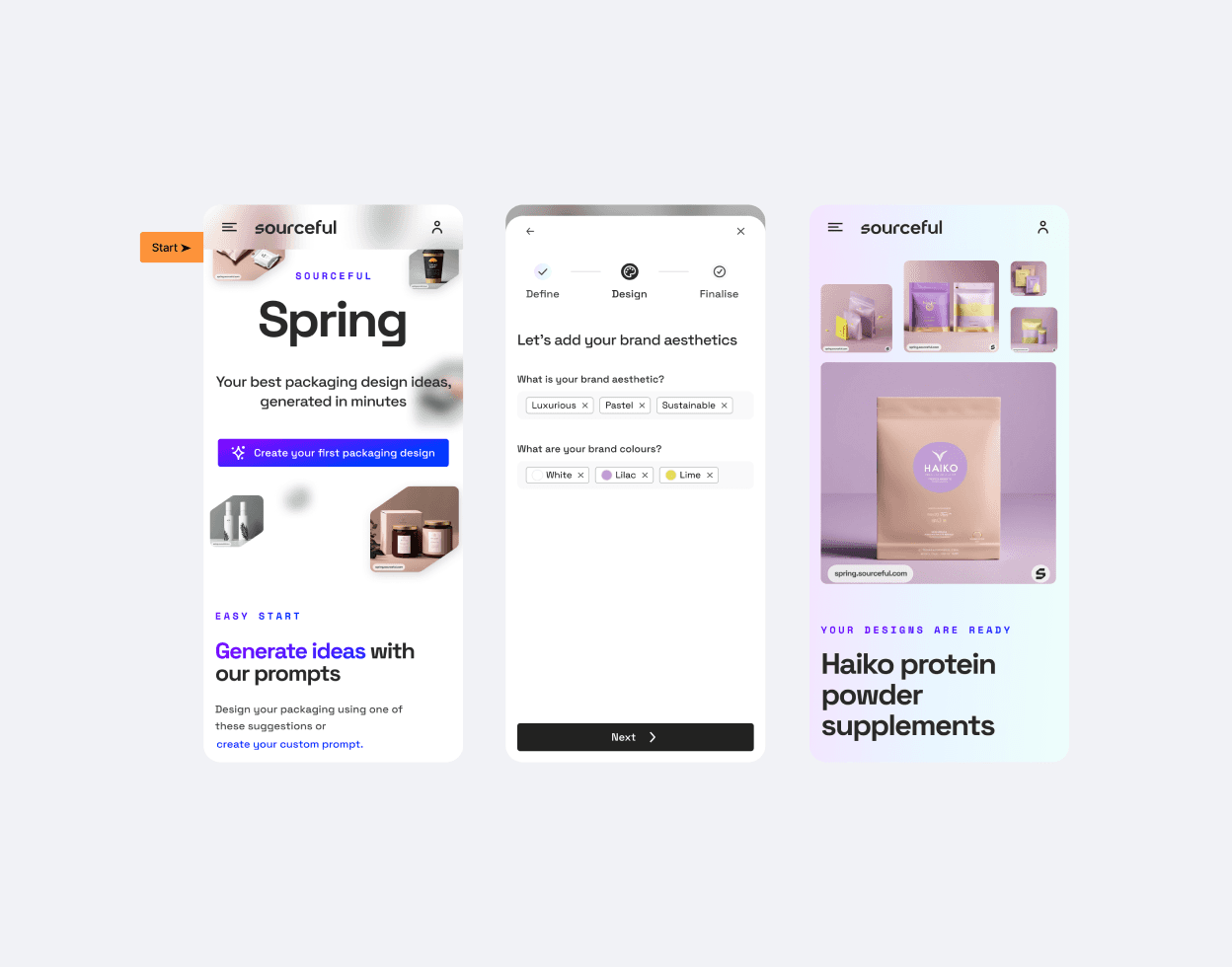
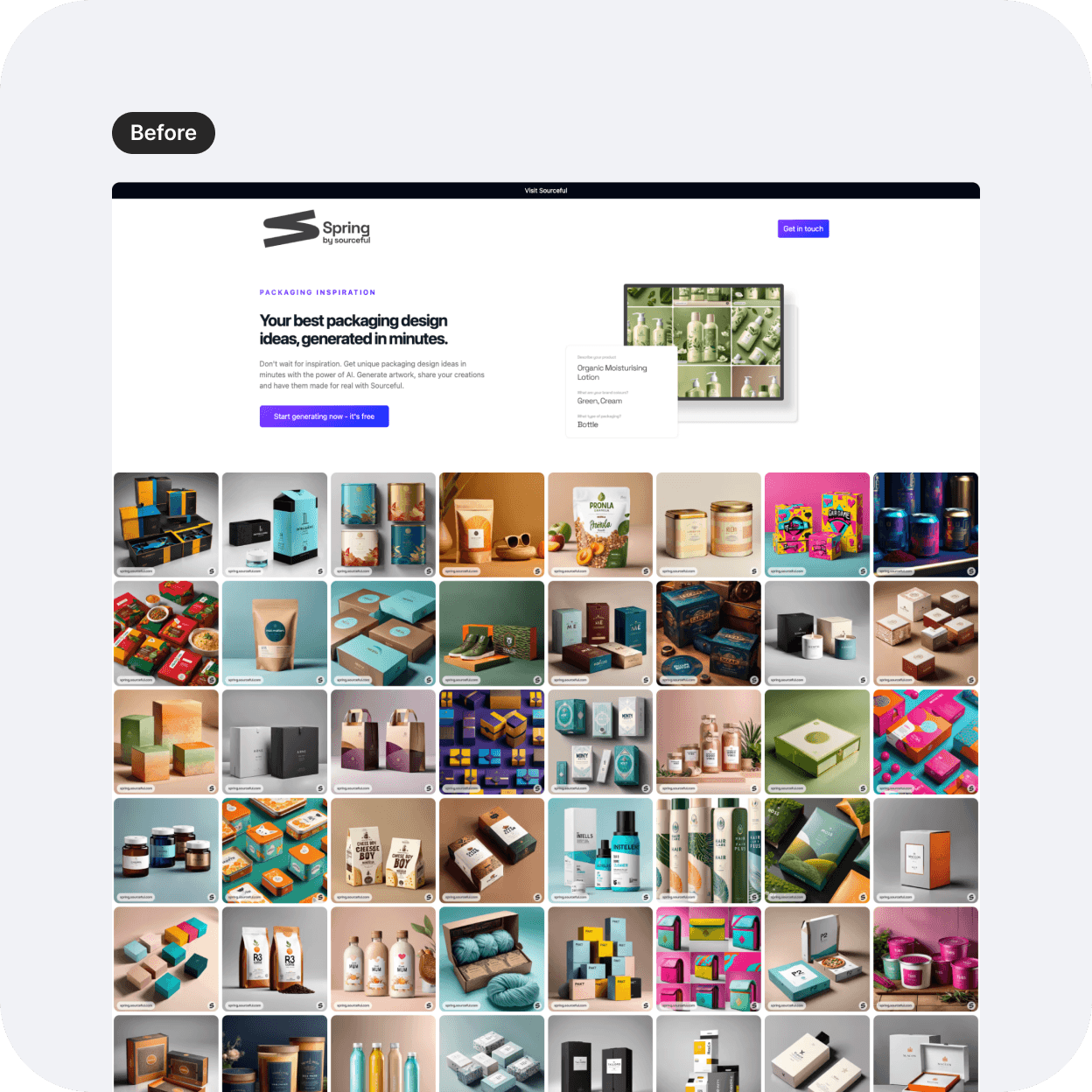
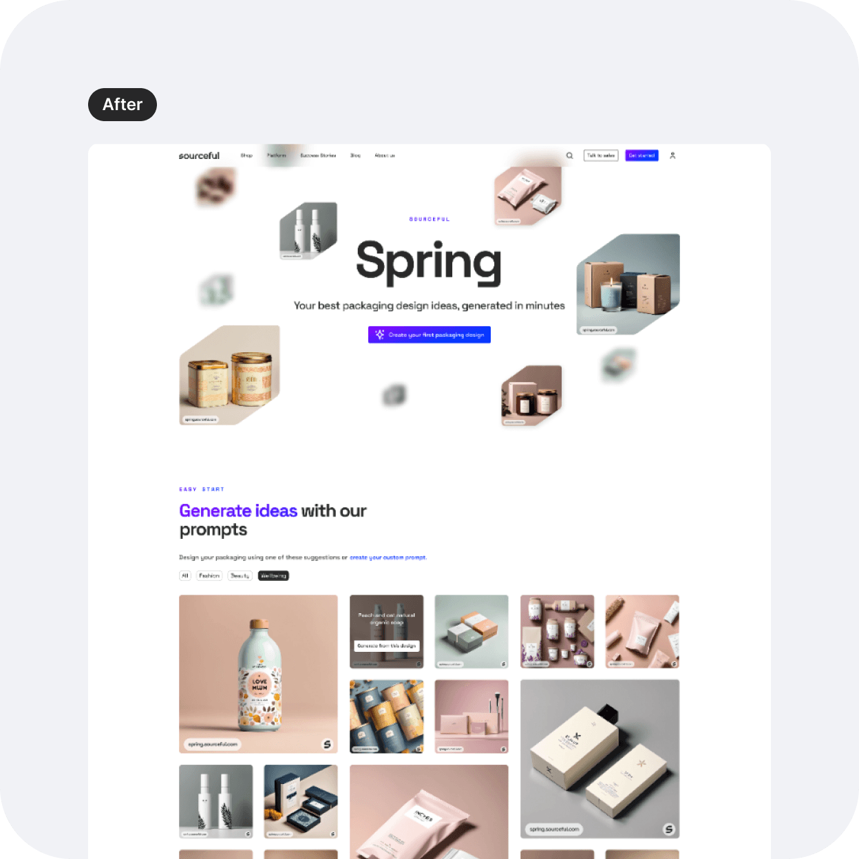
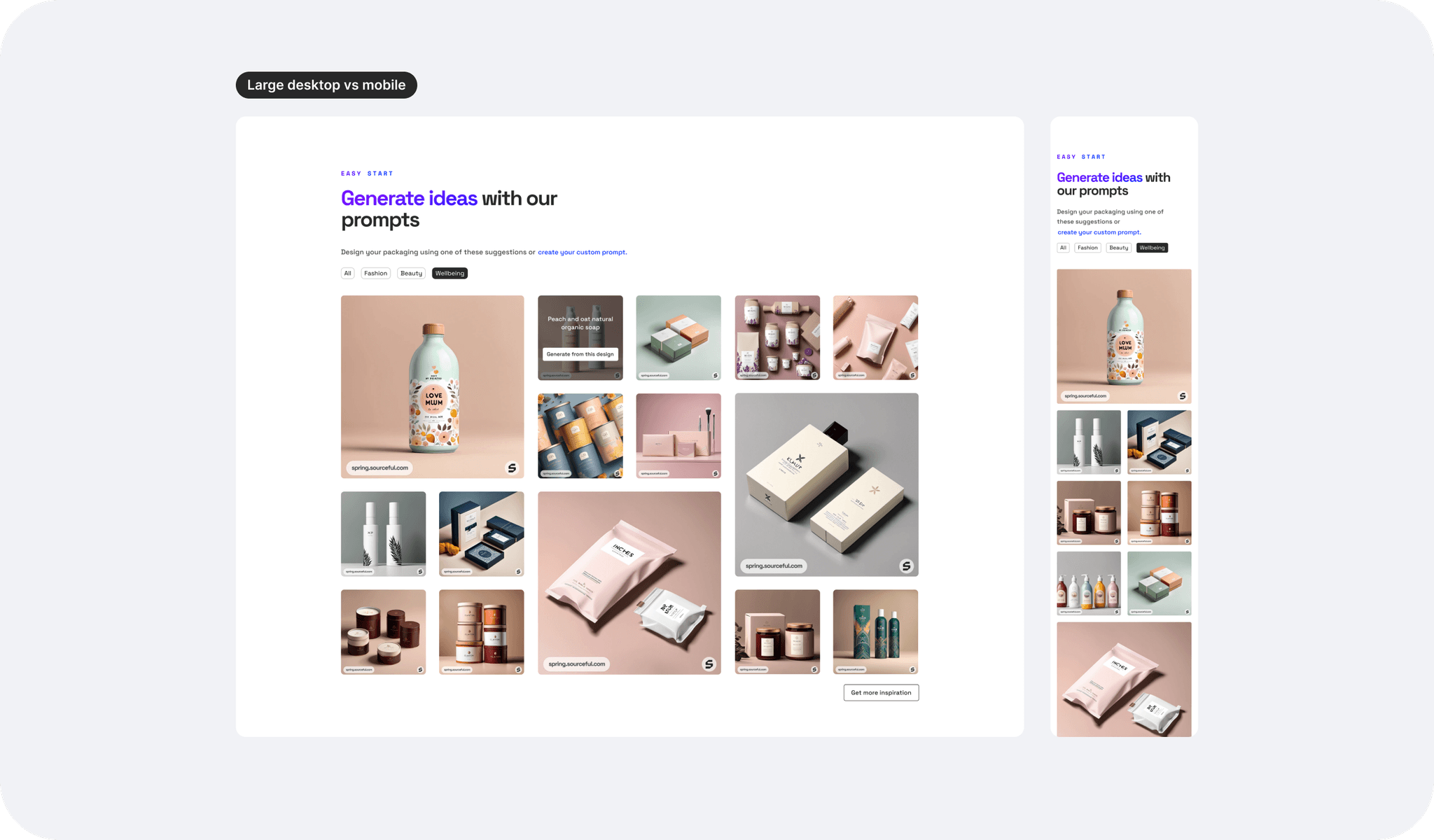
UI: The gallery
On the live version, the gallery images appear all at the same size, which felt a little redundant with endless scrolling. Surely, in some way we allowed users to see many ideas, but could this also feel maybe a little overwhelming, especially when viewed on a smaller laptop for example?
I therefore suggested to display the gallery with a different grid but all keeping the same 1:1 ratio, hopefully not complicating the work for the engineering team when implementing the new design changes. The page also becomes a little more dynamic this way.
We also added industries as filters so users would be able to narrow down their search if needed.
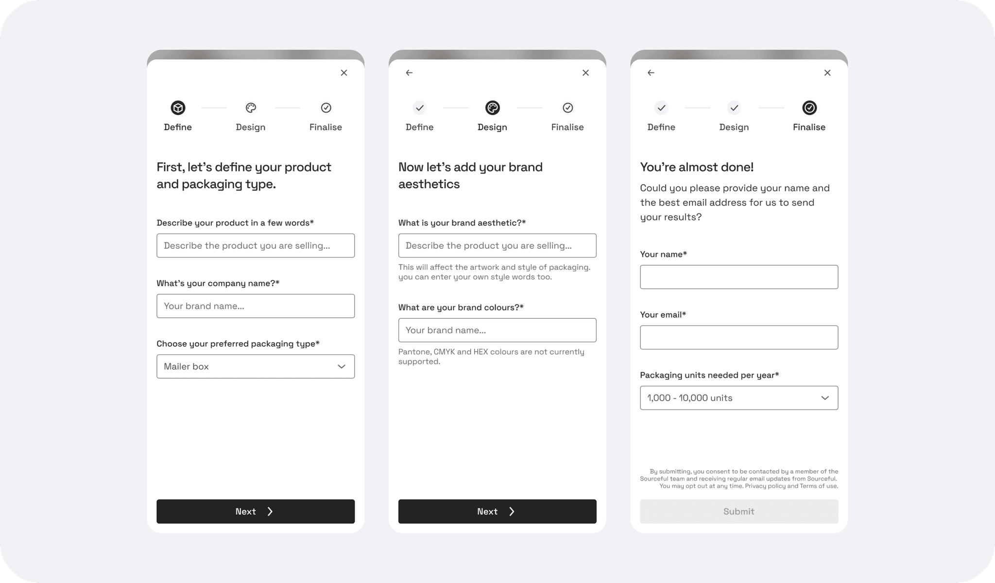
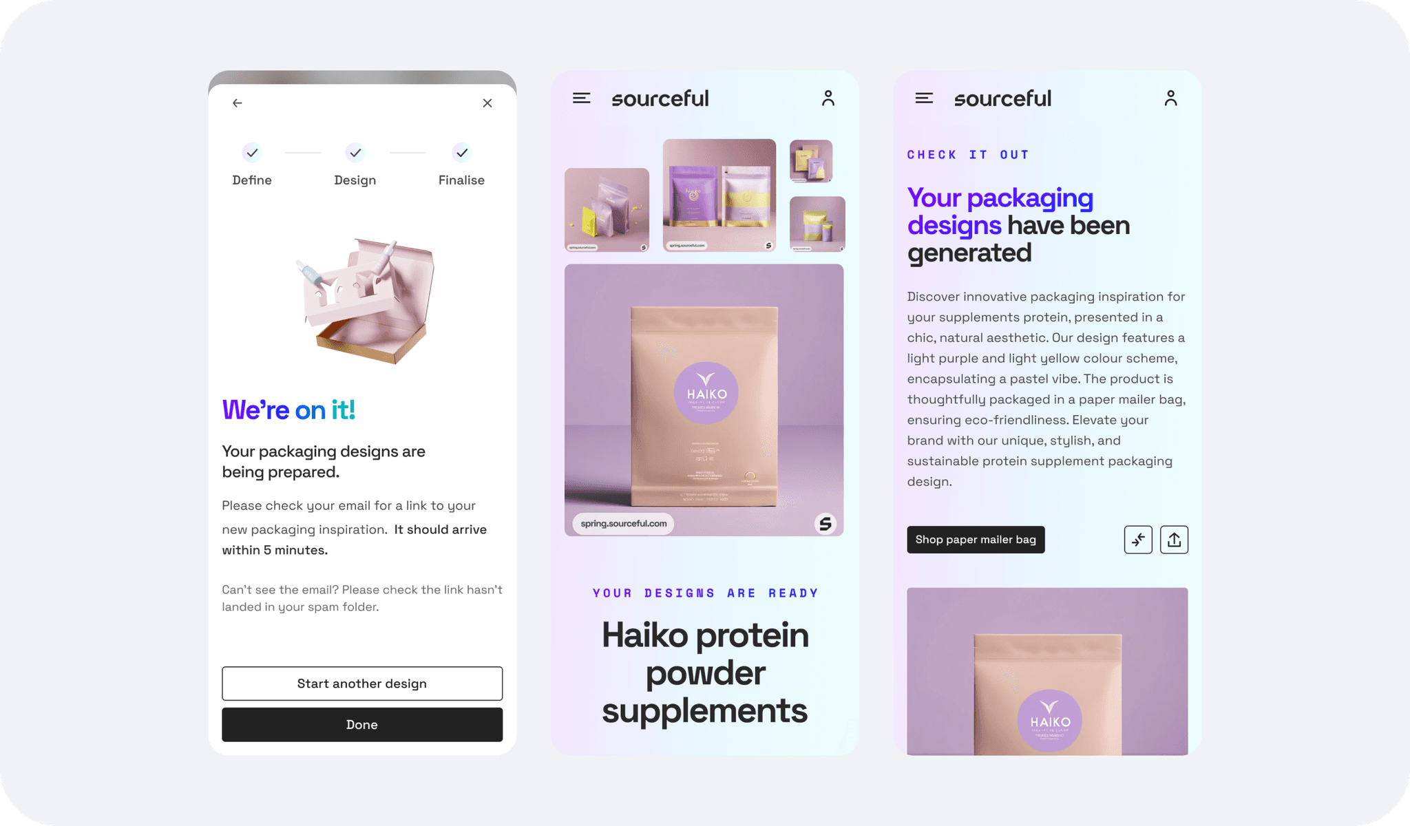
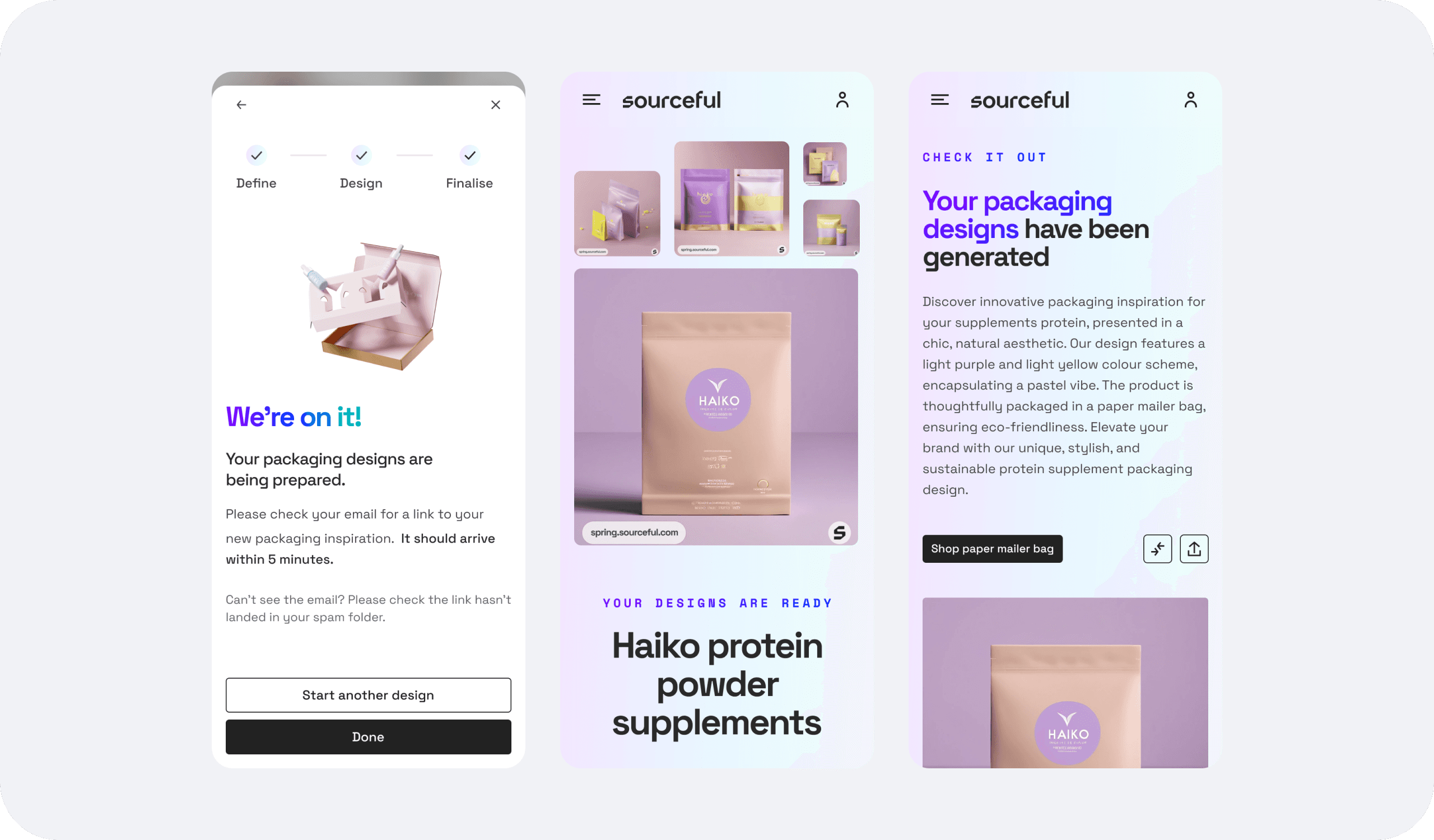
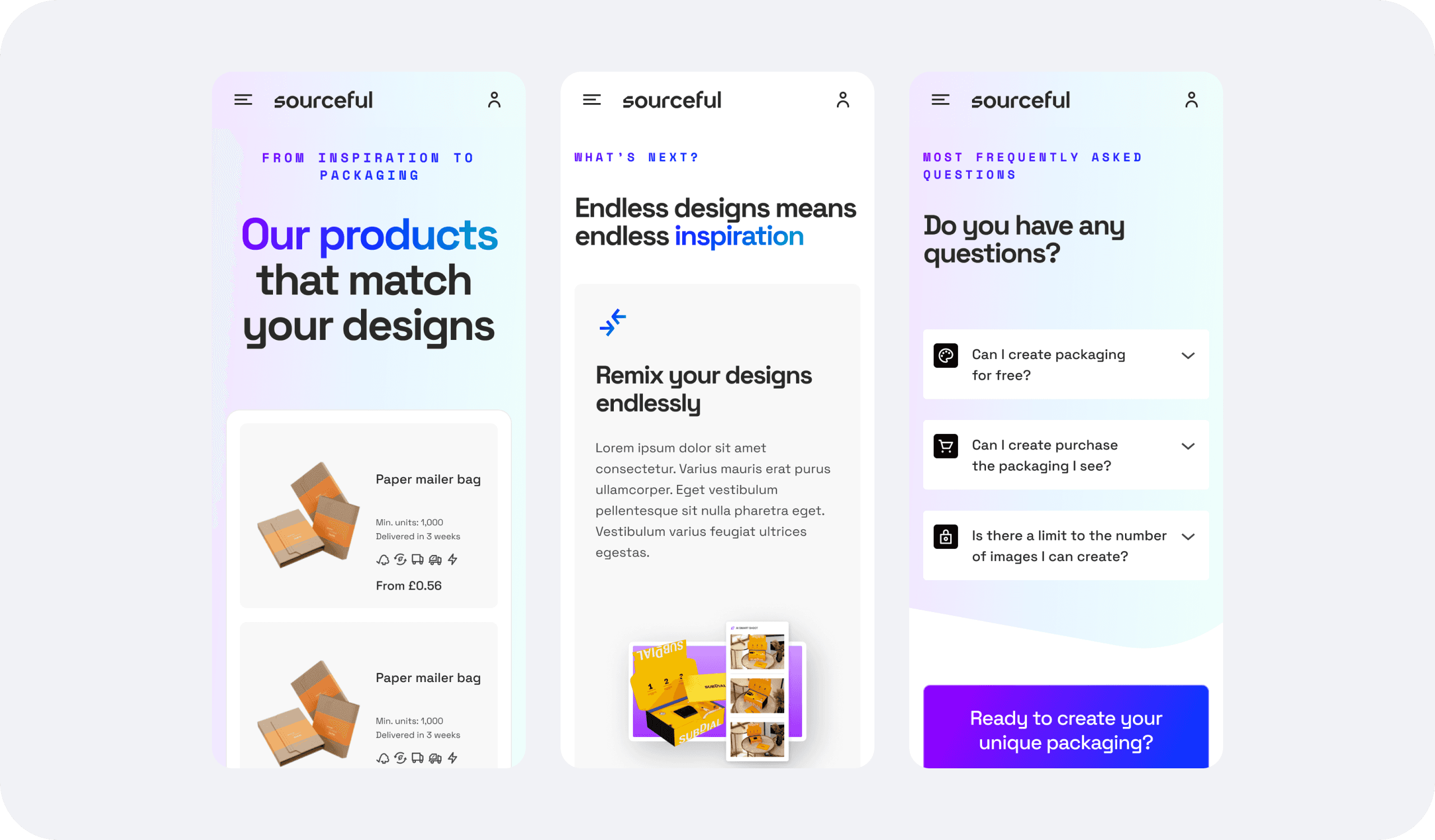
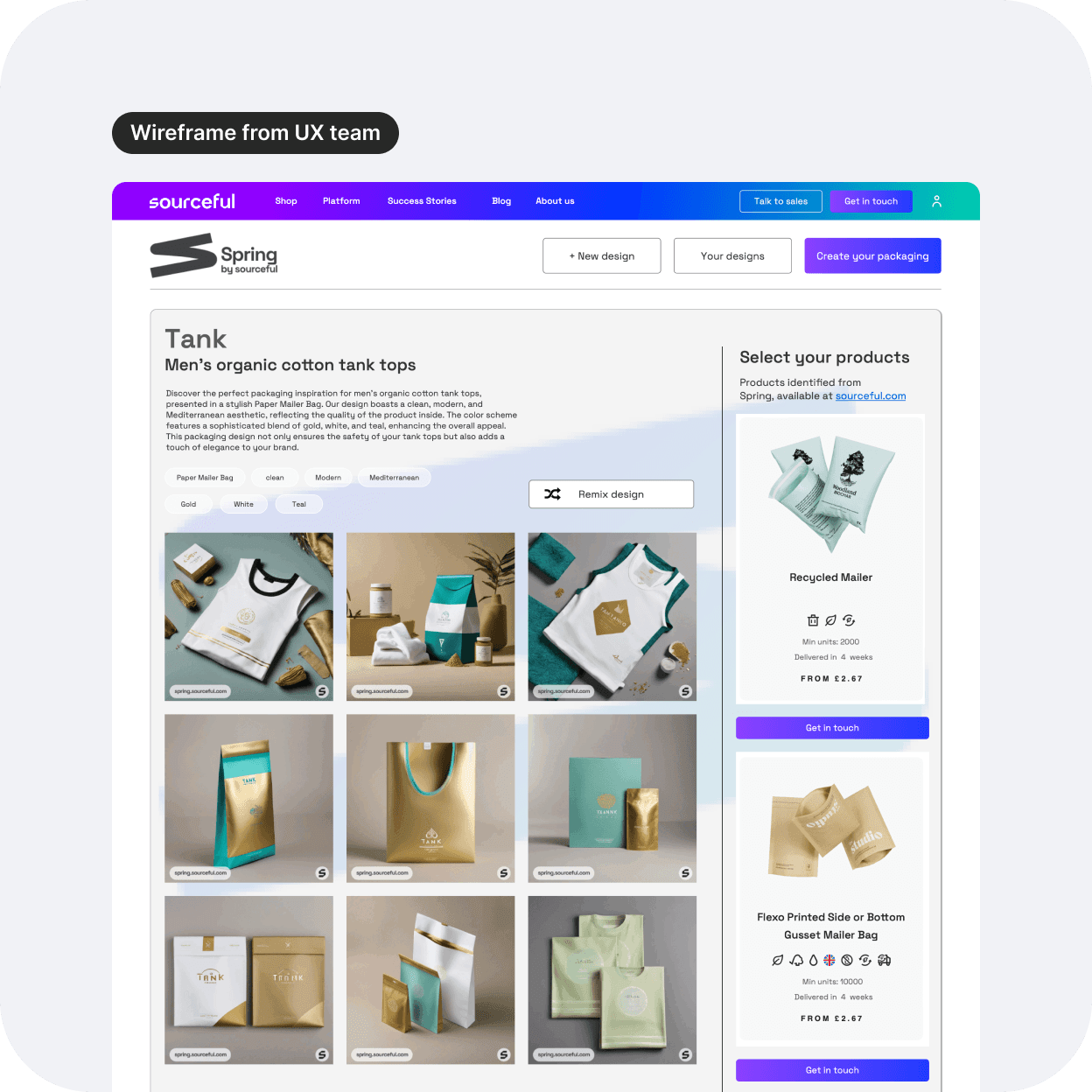
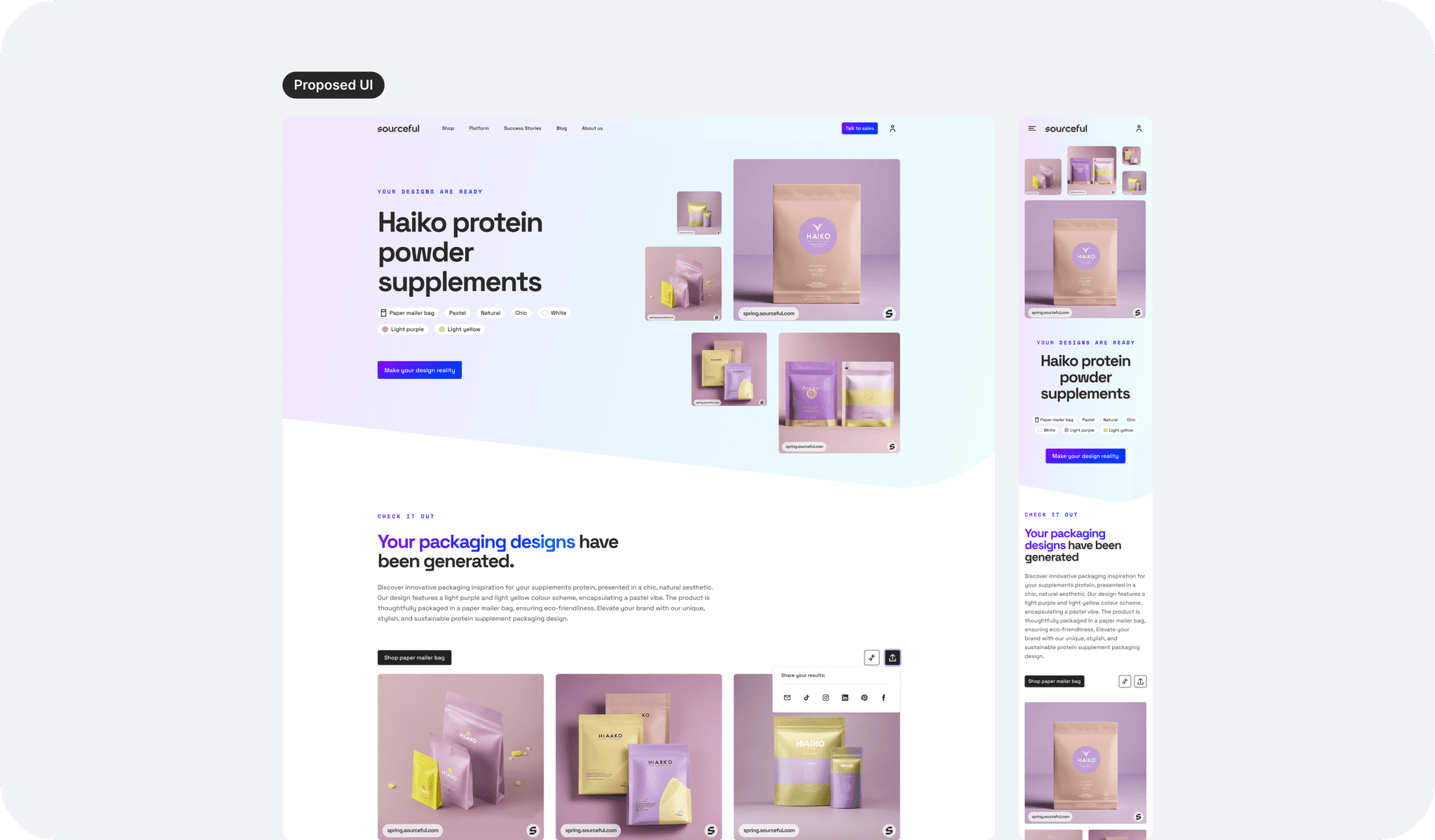
UI: The results page
Originally, the UX wireframe proposed to have text and tags within the header. Considering this is primarily a visual tool, I proposed to add the text further down the page and to display the images first with bite-size content instead (tags here work).
I tried the branded gradient background here and it seemed to tie in the elements of the title and images together much better than my original idea to have it on the landing page. Since there is more information displayed on this page as we scroll down, that gradient is also tying together the page nicely.
Results and impact
I presented the new design to the stakeholders and the project was approved.
A few weeks later, the company had a consequent change in strategy and structure, which means I am unable to see results on our users and the actual impact this new design has had on the business. However the new design has been built and is currently live at spring.sourceful.com so it could be that this tool and its redesign remained a high priority for the business to gain new clients.
Here are some screenshots below until a video comes out to show the flow better.