Sourceful shop revamp
Objective: to enhance the shopping experience for casual browsers and targeted shoppers by providing a more intuitive navigation and a clearer product discovery.
My role in this cross-functional collaboration
We worked as a cross-collaborative team with a researcher, the product manager and developers. I was involved at every step of the project and then led the final UI and expanded also the design system with a new card component.
The context and the problem
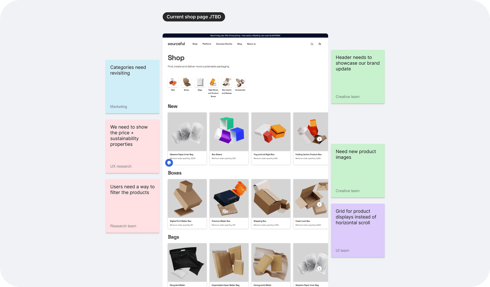
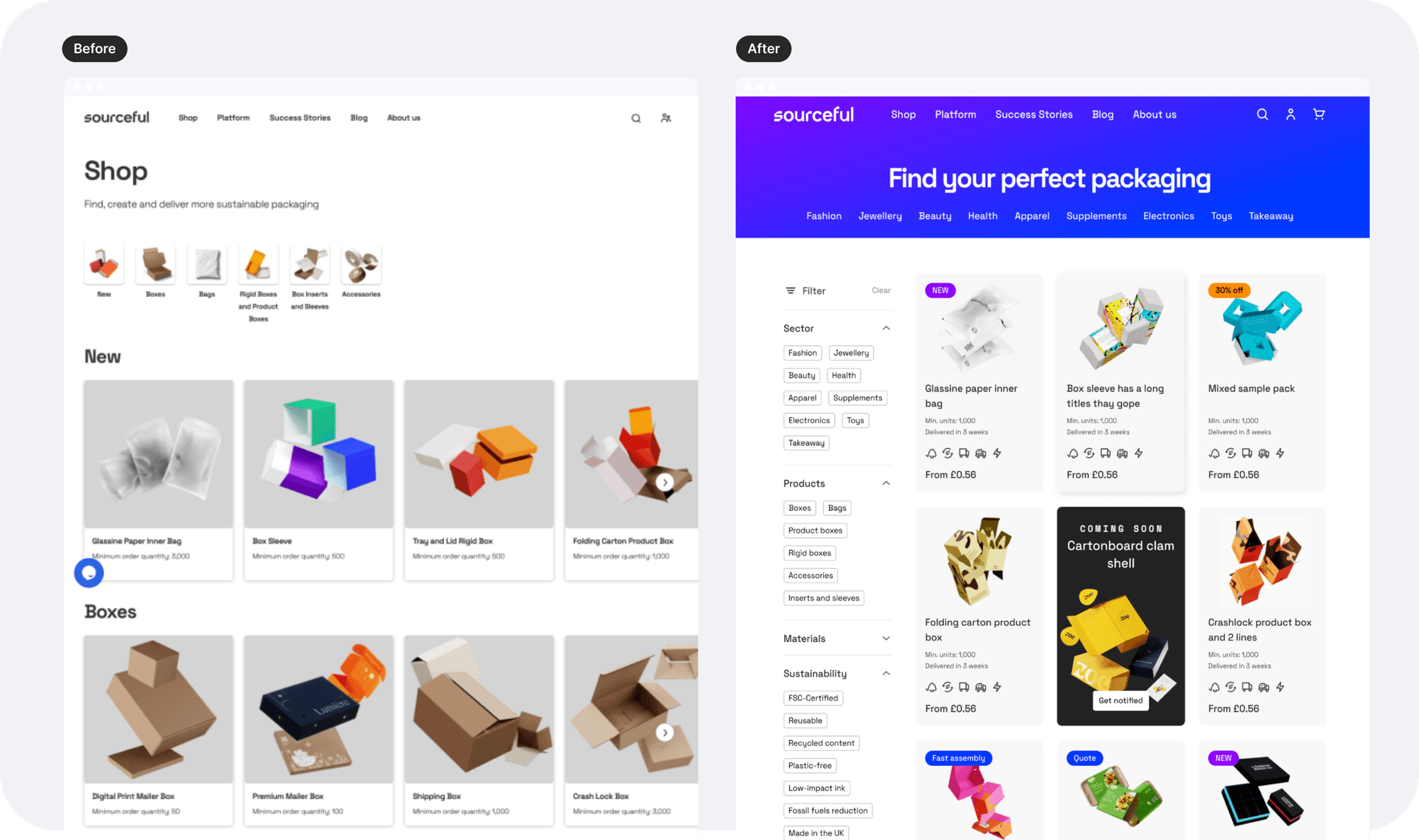
More products are being added to the catalogue and we only have a few categories to sort them out.
Categories are currently also the only filter for users to narrow down their search, so if we extend the catalogue range, we're about to make it even more difficult for them to find the product they're after.
This also significantly increases the workload for our customer service.
The goal, UX process, and some challenges
The redesign aims to assist both casual browsers and users who know exactly what they’re looking for, providing a seamless shopping experience and improving conversion rates.
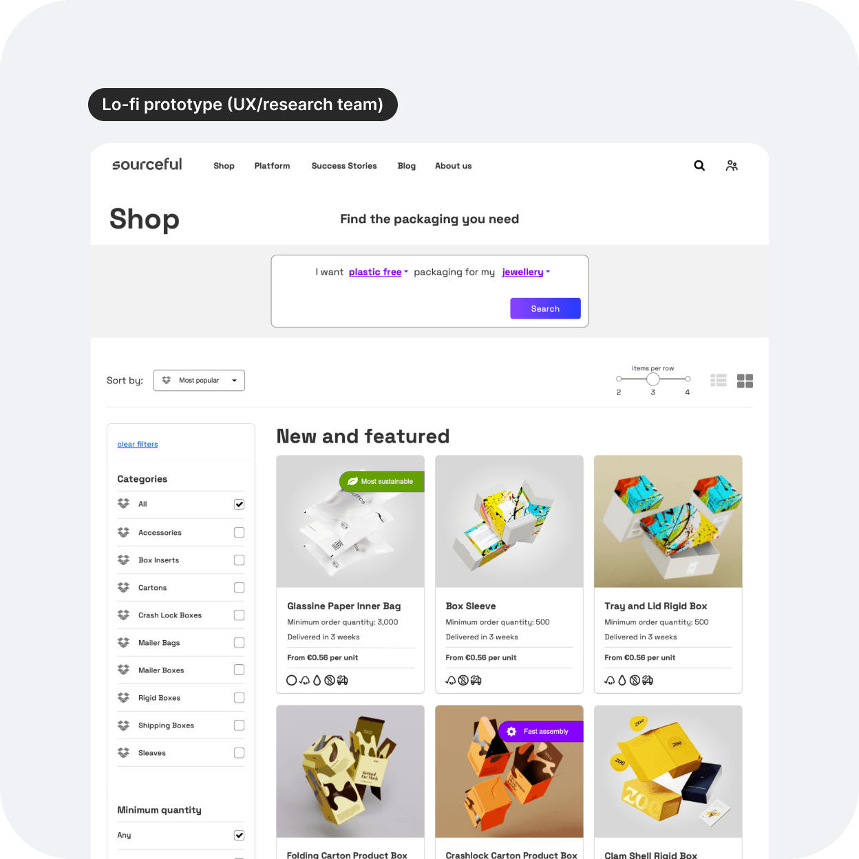
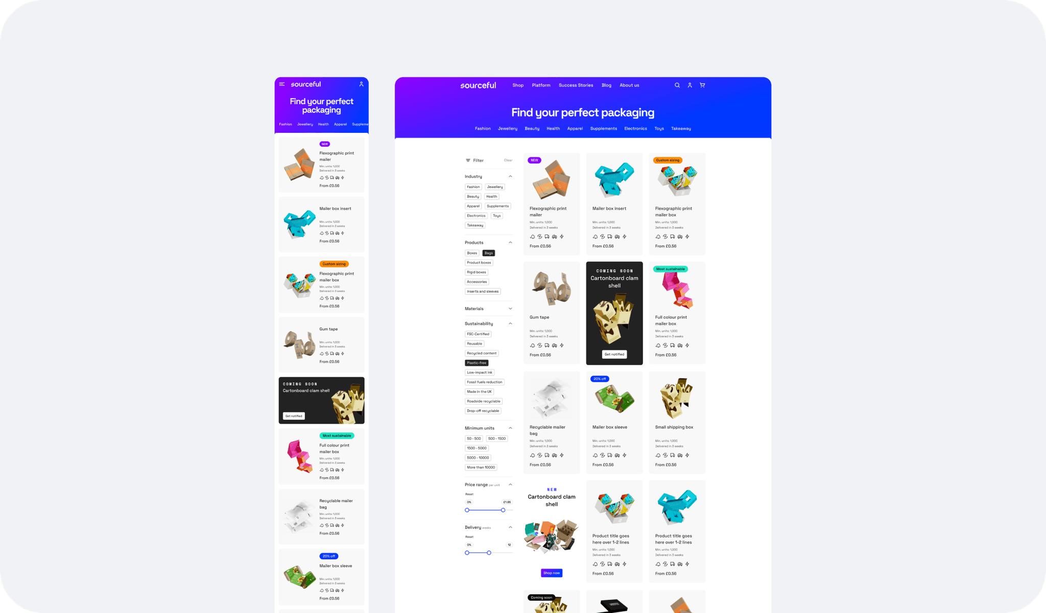
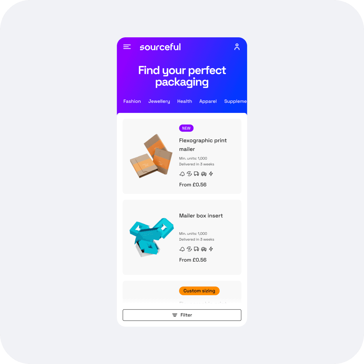
The aim is to deliver two types of pages, a general shop page and an industry-focused page, the latter so that we can better guide first-time users who can feel confused as to what type of packaging they even need for their product.
The plan was at first to include a sidebar filter panel and a product discovery top bar, however the latter proved to be more complex to implement and was left for the next round of iterations.
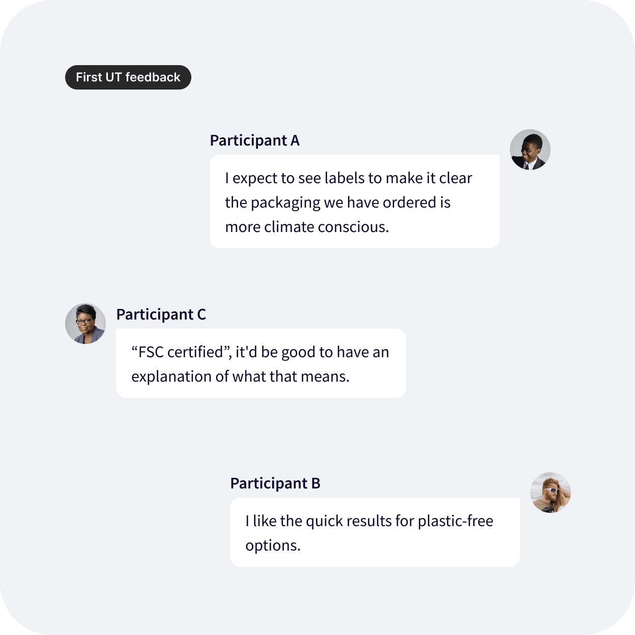
A prototype has now been tested with a few options, and this helped our research team refine the wireframes. I can now get started on the UI.

Focusing on two essential changes for UX improvement
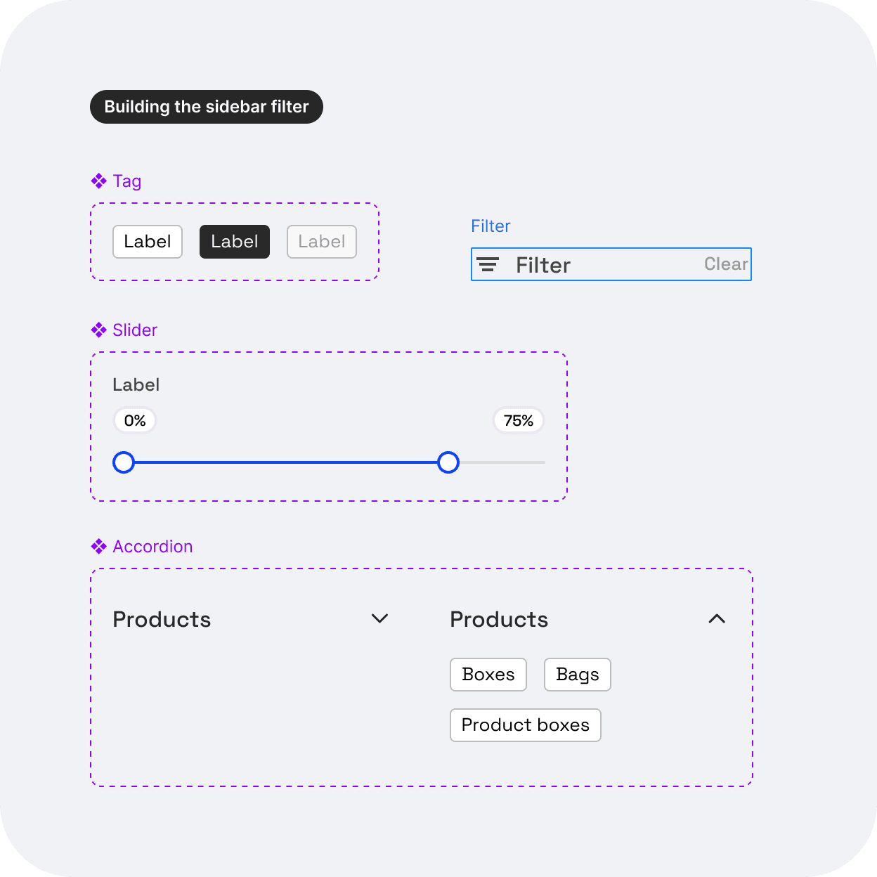
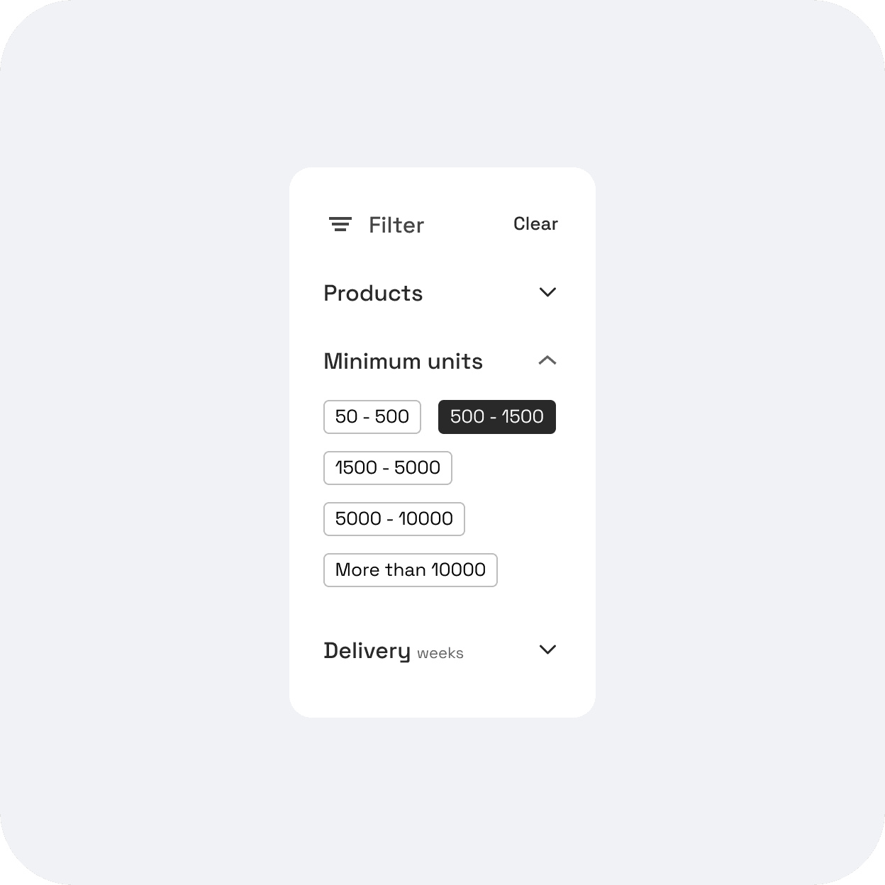
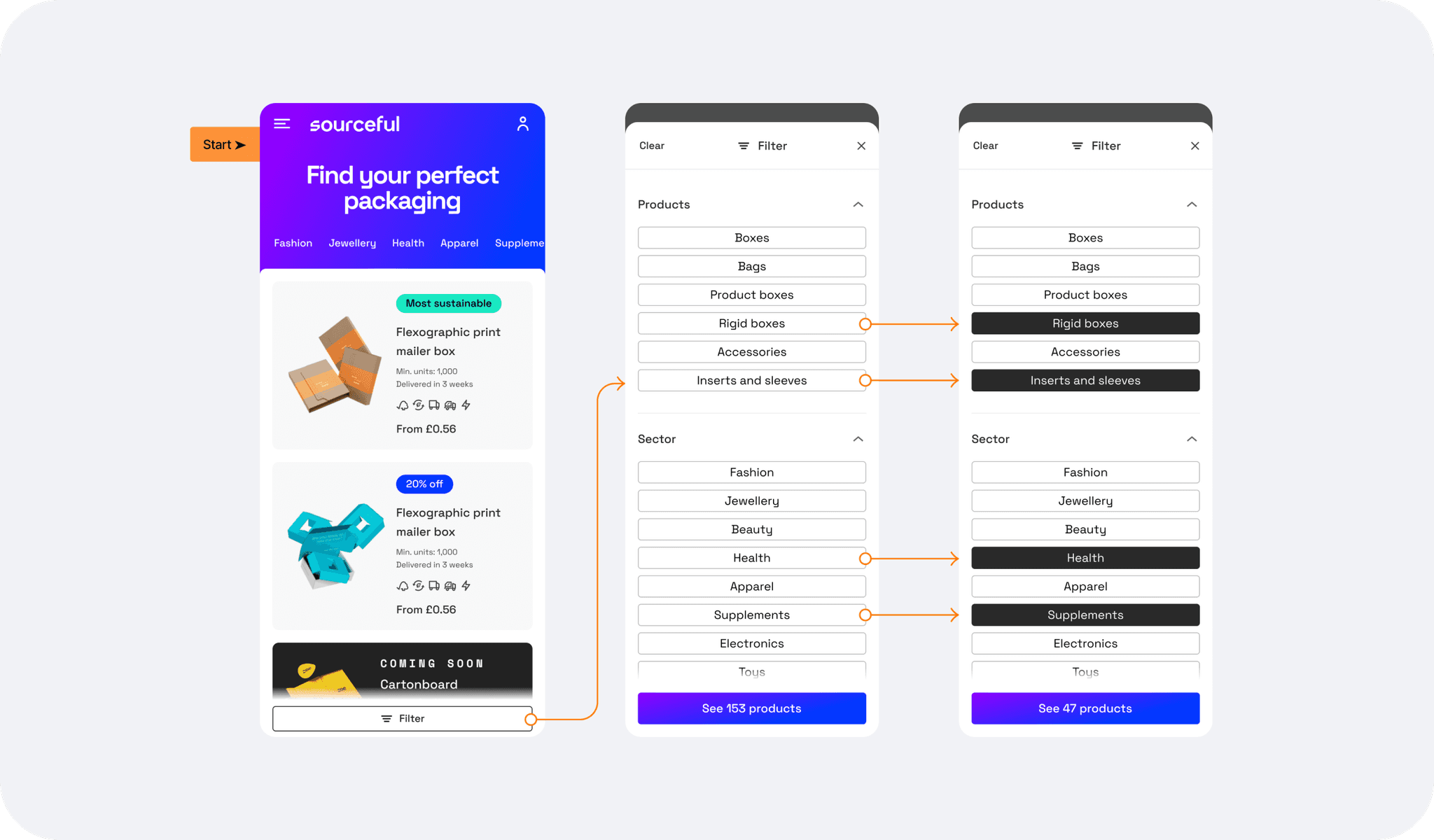
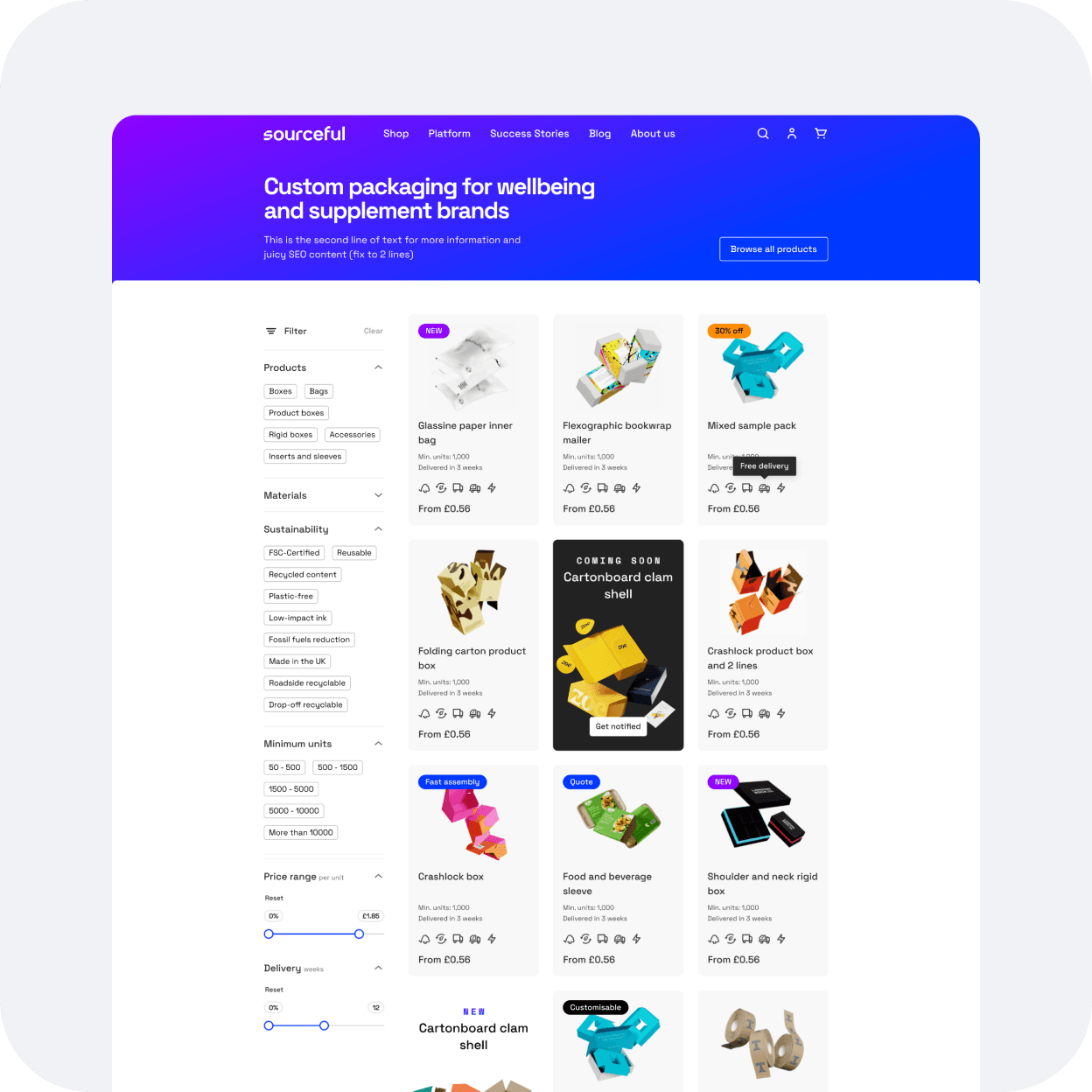
The sidebar filter: the most essential add-on to the shop page, as per Jakob's law. It should allow our 2 types of users to find the packaging they need with less effort. The sidebar filter is also scalable as to the type and the amount of filters we can display to better match our users expectations and needs.
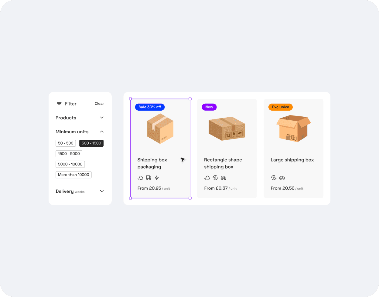
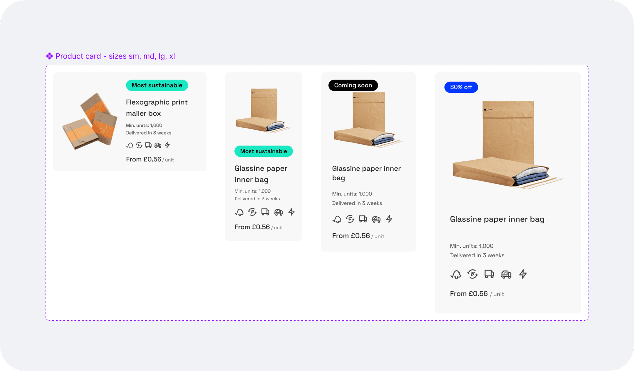
The new product card: effectively displaying price, minimum quantity, and adding better product images.
Refining the sidebar filter
Research: still following Jakob's law, I started researching effective sidebar filters on non-competition websites to create a list of what could work for us, and spark any more ideas.
The provided wireframes showcased a checkbox component for most of the filter categories, so I tried to add more visually appealing filters like tags instead, to make the filtering process a bit more intuitive, accessible, and easy to use, keeping in mind further improvements like colour dots if one day we offered coloured packaging for example.
Designing the product card component: process and challenges.
Balancing essential user information with stakeholder requests was challenging. We resolved this by using visual elements like badges and icons for secondary information and prioritising the price as the main addition to the product card.
I then added colourful badges to add in sections (New, on sale etc.) to bring in some of the new brand colours and defined the best placement that would prevent colour clash with future product imagery.
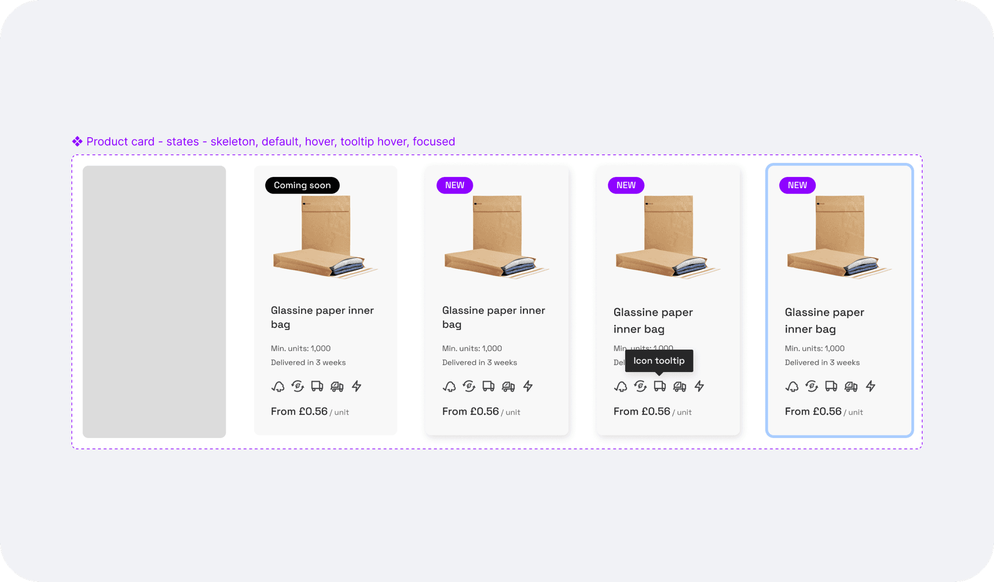
Adding icons for sustainability as a test to see if our users would find them useful, and to prevent confusion, a tooltip shows on hover (and on tap for mobile).
The mobile version had to be revised as the product card was not displaying well during implementation, therefore we shifted the orientation to landscape for mobile which solved the issue.
Finalising the grid layout and signing off the designs
I documented and published the new component (slider and product card) onto the Design system.
Back to the UI, I checked responsiveness and accessibility.
A marketing card was added to break the grid and add emphasis on some of the new product launches.
I created an industry-focused landing page, keeping the same design but adding a slightly different header.
Learnings, and next steps
The revamped shop page successfully met the needs of both casual browsers and targeted shoppers. Enhanced navigation, improved product discovery, and increased user satisfaction demonstrated the effectiveness of our user-centric design approach.
Next steps:
Adding the product discovery bar under the header after testing, and once the full latest catalogue range is uploaded.
Monitoring the product card component interactions through Logrocket sessions and user testing feedback for further iterations.